Introducing “Greenery” – Pantone Color of the Year
May 12, 2017
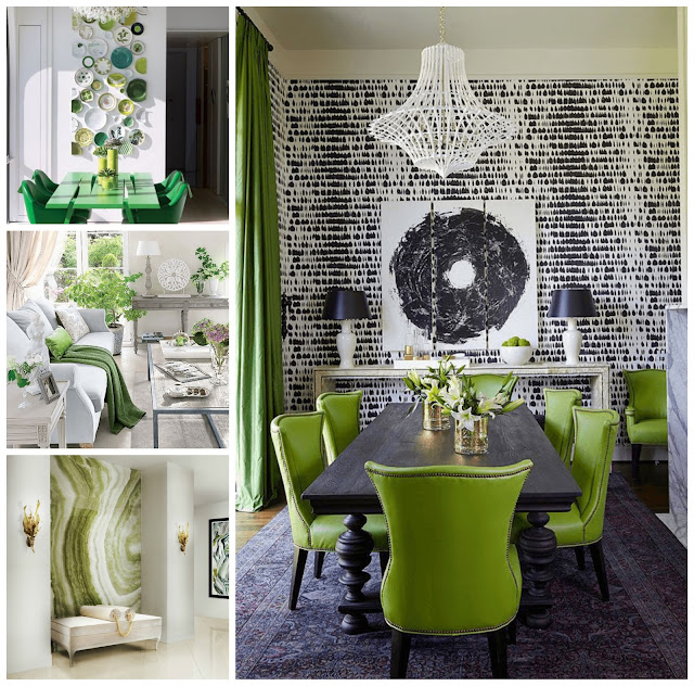
 After last year’s 2016 colors of the year, “Rose Quartz” and “Serenity”, “Greenery” comes as a fresh and revitalizing tone for the year – symbolizing an energetic new beginning. Perhaps the most obvious evocation for the color is nature itself – “greenery” omnipresent throughout the natural world – luscious foliage, deep pastures of grass, and wild forestry. Color experts at Pantone reflect, “Greenery is nature’s neutral”.
 Here, a bountiful tablescape, is on display. Centerpiece arrangements act as runner – filled with green hydrangeas and white roses. A ceiling of delicate orchids in alternating green and white offers an immersive experience for guests. The setting is appropriately outdoors – amongst the living “greenery” of trees and the lawn. Natural wood accents in the plates and vase containers perfectly compliment the color palette.
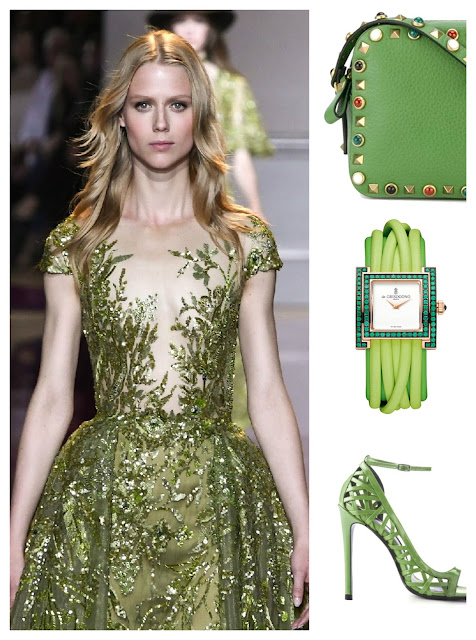
Perhaps where the most striking example of the color trend is in fashion. Recent fashion houses such as Kenzo, Michael Kors, Zac Posen and others have used the color in vibrant prints ready on the runway for their 2017 lines. “Greenery” is definitely a “statement” color when it comes to apparel – it is best worn in a dramatic fashion or on a smaller scale in accessories such as watches, handbags, and shoes.
Recent Posts
- Weddings by EPI Fall Style Shoot
- A Very Pink Chic Birthday Bash in Laguna
- Elite Productions International Produces Top 100 Event in the Country by BizBash
- Elite Productions International is named among Top 50 Event Companies of 2019 by Special Events
- One Black Tent, Two-Night Party
- Presidential Pink | EPI celebrates the installment of its VP to President of MPI OC with a Rock Opera
- For the Love of Purple Engagement Party
- BizBash Covers EPI's Rock Opera Inspired Event and Floral Design at the Nixon Library and Museum
- After Party at the Sheats Goldstein Residence
- EPI's Pawntra Shadab is the recipient of the 2019 Smart Women In Meetings Award


